
EMT Emergency Medical Service Report
A Power BI dashboard summarising an entire ambulance operation on one screen
- 11.577
- Cases Analysed
- 00:13:23
- Avg. Response Time
- %92,6
- Completed Transports
- 10
- Case Types
Overview
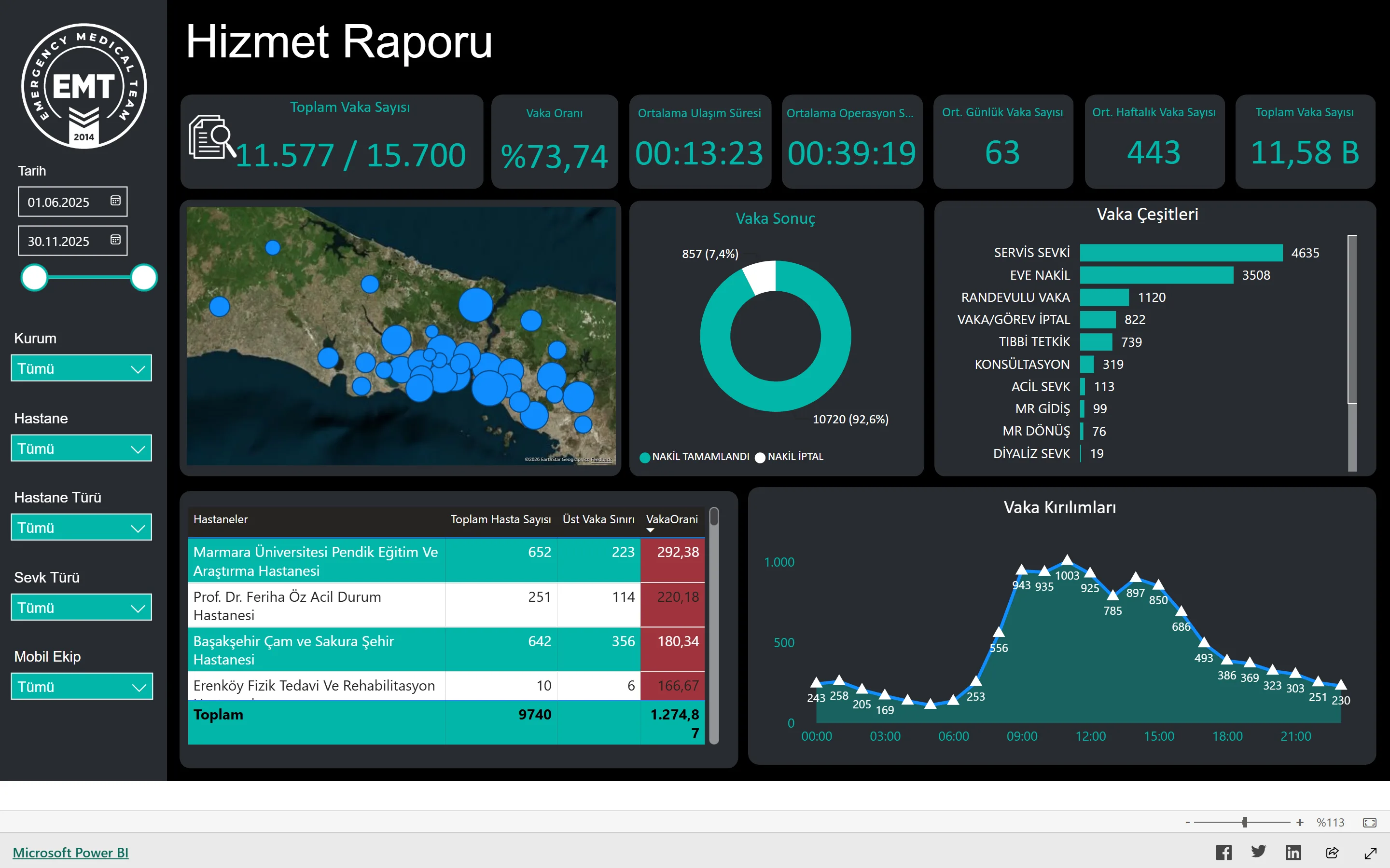
In an emergency medical operation, only measurement closes the gap between the feeling that things are going well and actual performance. This report was built for exactly that: it makes visible, on one screen, where and when more than eleven thousand cases over a six-month period were transported, to which institution, and how long each took.
The top strip takes the operation's pulse: total case count and quota utilisation, average response time, average operation duration, and daily and weekly case averages. Those five figures answer "how are we doing today" in a second.
The visuals below explain why. A map of İstanbul shows the geographic concentration of cases; a transport-outcome ring separates completed from cancelled transports; a case-type bar chart ranks ten categories from service referrals to dialysis transfers by volume. The hourly breakdown is the single most important input for shift planning: demand jumps after six in the morning and peaks at specific hours through the day.
The most operational part of the report is the hospital table. For each hospital it places total patient count, the contractual case ceiling and utilisation against that ceiling side by side; conditional formatting paints hospitals over quota in red. Which contract needs renegotiating becomes obvious at a glance.
With filters for date range, institution, hospital, hospital type, referral type and mobile team, the same dashboard serves both as a management summary and as a performance review of a single crew.
Highlights
- End-to-end analysis of 11,577 cases over a six-month period
- Average response time 00:13:23, average operation duration 00:39:19
- 92.6% of transports completed, with cancellations tracked separately
- Per-hospital quota tracking, with over-quota rows flagged in red
- An hourly case breakdown feeding directly into shift planning
- Geographic concentration of cases on a map of İstanbul
Objectives
- Turn operational performance from a feeling into a measurement
- Continuously monitor quota usage across hospital contracts
- See the hourly distribution of demand and plan crews accordingly
Solution
- Merging case, hospital and institution data into one model
- DAX measures computing response and operation durations
- Conditional formatting that colours quota overruns
- A map visual for geographic distribution
- Filters for date, institution, hospital, hospital type, referral type and crew
- Published via Publish to Web, reachable by anyone with the link
Approach
- 01Agreeing the metrics to track with the operations team
- 02Cleaning and modelling the case records
- 03Building the measures and visuals
- 04Publishing the dashboard and reviewing it with management
Outcomes
- Case performance became trackable without waiting for month-end
- Hospitals over quota are visible at a glance
- The hourly demand pattern now feeds shift planning
- The report can be shared with stakeholders directly by link
Challenges
- Reconciling records from different institutions and hospitals into one model
- Keeping duration calculations honest when cases are cancelled
- Keeping the dashboard responsive at high row counts
Selected Work
Similar projects
Sales Performance Dashboard
An interactive Power BI dashboard for analysing e-commerce sales data, covering KPI tracking, channel comparison and trend analysis.
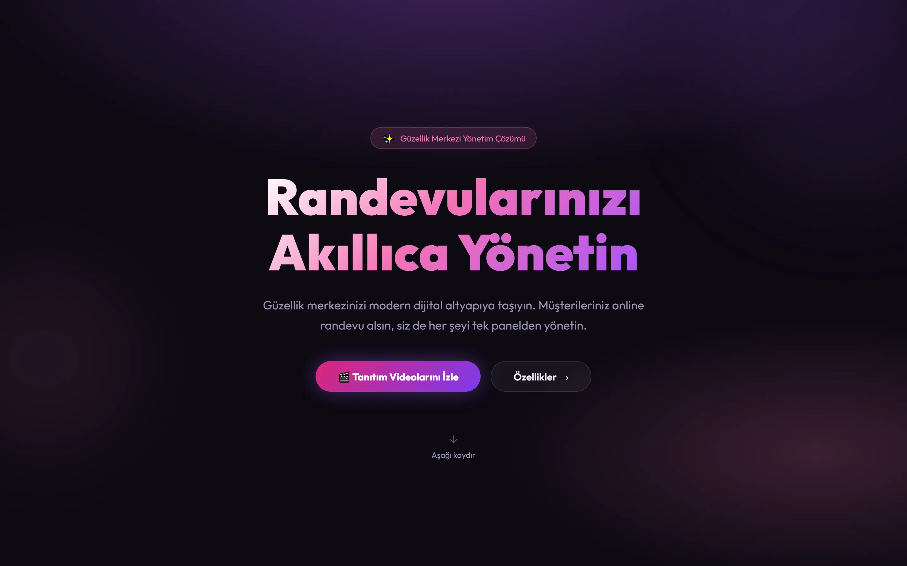
Beauty Salon Appointment System
A system that brings appointments, staff and client records for beauty salons into one panel. Clients book online around the clock while the business manages everything from a single screen.
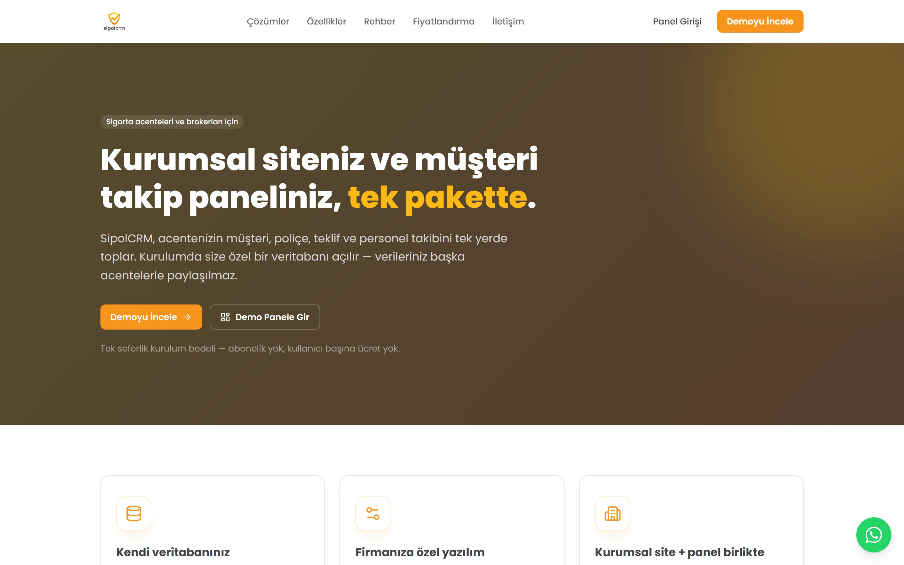
SipolCRM — Insurance Agency CRM
A CRM that brings client, policy, quote and staff tracking for insurance agencies into one package. Each agency gets its own isolated database, with no subscription or per-user fee.